Introduction
More people now use phones instead of computers to visit websites. If your site doesn’t work well on mobile, users will leave quickly. That’s why mobile site optimization is essential for every business.
Mobile site optimization makes pages load quickly and easily. In this guide, you’ll learn how to improve speed, layout, and mobile features. We’ll start with responsive design testing to ensure your site looks great on every screen.
Improve Appearance with Responsive Design Testing
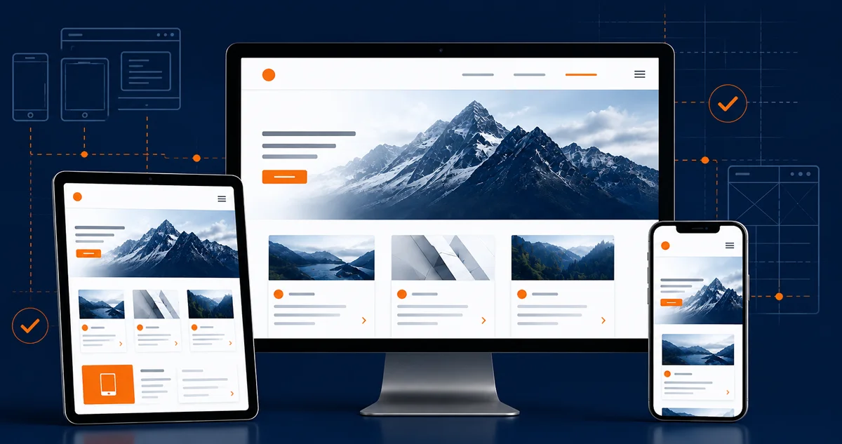
Responsive design testing checks how your site looks on all screens. It makes sure text, pictures, and buttons fit on phones, tablets, and computers. If pages appear messy or don’t display well, users may leave quickly without taking any action.
One store tested its site and identified text issues on small phones. Some headings were cut off, and images didn’t load correctly. After fixing it, their mobile site optimization score went up by 30%.
When you optimize for mobile, your site looks better and runs faster. A well-designed layout helps users navigate without confusion or delays. Clear pages also help search engines read your site more easily. This, in turn, improves your visibility.
Good design keeps people on your site. If it looks clean, users stay and click. Now, let’s look at mobile usability testing. It shows where users get stuck and what to fix to make your site easier to use.
Detect Frustrations with Mobile Usability Testing

Mobile usability testing focuses on how real users interact with your site. It shows where people tap, swipe, and where they get stuck. This testing helps you to identify design issues that cause visitors to leave your site early.
A retail site used mobile site optimization and testing tools to fix menu issues. Users had trouble finding products and clicking on links. After making small changes, their bounce rate dropped by 17%.
Fixing those problems improved the site’s flow. With the help of Google Mobile Test, site owners could see how real users experienced their pages. It highlights weak spots, such as buttons that are too small or text that is hard to read. Resolving these details makes a big difference.
Clean buttons, clear menus, and smooth scrolling win the clicks. Now let’s explore how lazy loading images makes pages load faster and saves data. This method provides your mobile site with a speed boost. It also improved overall performance.
Speed Up Pages With Lazy Loading Images

You can design your site to only load images when users scroll near them. This trick makes pages load faster and uses less data. People no longer have to wait for all images to load at once. It’s a quick and simple upgrade that enhances mobile site optimization.
A news blog experienced a 35% drop in load time after implementing lazy loading images in its mobile setup. Their optimization score also improved. Users could open articles more quickly and read them without delay.
Images, when loaded too early, eat up memory and delay other content. By waiting to load them, your site responds quickly. This makes a big difference, especially for content-heavy websites that rely on images.
Smart image loading boosts both experience and SEO. Mobile site optimization reaches its peak when speed is a top priority. Next, we’ll uncover hidden off-page and technical problems you can fix with a mobile SEO audit.
Catch Technical Errors with an SEO Audit for Mobile

An SEO audit for mobile helps you identify issues that prevent your website from performing optimally on mobile devices. It checks for broken links, slow loading, and bad redirects. These issues make your site difficult to use. They negatively impact its search rankings.
One company ran an SEO audit and found blocked pages, messy code, and missing tags. After implementing mobile site optimization, their site worked better and loaded faster on all phones. It also aligned with mobile first indexing requirements.
Audits also verify that your site passes responsive design testing and utilizes lazy loading images. These tools show which parts need updates. Small changes in layout and speed make a big difference for mobile users.
Always test your mobile version site to ensure it is easy to use and runs smoothly. In the next part, we’ll look at how tools for analytics help you track user behavior.
Track and Adjust Using Mobile Analytics Tools

Analytics tools reveal how people interact with your site. They reveal which pages visitors open, where they click or tap, and when they leave. That feedback helps you identify and fix issues quickly, making more informed design choices.
One brand learned that 60% of users left before scrolling down. They immediately got to work. With mobile site optimization, they changed the layout and menus. That simple fix reduced drop-offs and kept users engaged longer.
When you combine these tools with responsive design testing and mobile usability testing, you get a fuller picture. You’ll find what works, what needs fixing, and how to plan your next steps. These updates help you keep your mobile site current.
Mobile site optimization is not a one-time fix. Use analytics tools to help with your decisions and improve your site over time. All these build strong mobile performance, which leads to lasting growth.
Frequently Asked Questions
How do I optimize for mobile without redesigning everything?
Compress images, remove clutter, and test layouts. These small changes improve your site’s speed and flow without doing a complete rebuild.
What is mobile first indexing, and how does it affect my rankings?
It means Google uses your mobile site to decide rankings. If your mobile version is weak or slow, it can reduce the number of people who find your pages.
What does a Google Mobile Test check for?
It checks how mobile-friendly your website is. It looks at screen fit, text size, and tap targets. This helps improve mobile usability and user experience across devices.
When should I run a mobile SEO audit?
Run this audit every few months or after significant changes. It checks speed, layout, and mobile issues that could hurt performance. This way, users stay longer on your site.
What should I ensure in my mobile version site?
It should load fast, show key content, and be easy to navigate. Keep menus short and tap-friendly. Focus on clear design and strong mobile structure.
How do mobile analytics tools help optimize performance?
They show how users move through your site. They track where users stop or leave. This data helps you fix weak spots and improve mobile speed and design.
Conclusion
Mobile users won’t wait for slow, clunky pages. If they aren’t satisfied, they’ll leave your site and find a better option. That’s why mobile site optimization matters now more than ever.
Use mobile usability testing, page speed tools, and shrink images. Regularly check your performance and adjust your design accordingly. These changes result in a smoother experience on your website. It keeps users engaged, builds trust, and attracts more visitors.
Start Mobile Site Optimization for Faster Results
Boost growth with mobile site optimization that improves speed and design. At The Strategic Tech, we use smart fixes like lazy loading images to keep your site fast, user-friendly, and engaging on every device. Get Started Now!